Billie
Redesign of Website to update product offering and elevate UI
About Billie
Billie is a B2B fintech based in Berlin. The onboarding of customers went always through sales. We believed a more cost effective opportunity was a self sign up.
My Role
I was responsible for the information architecture, competitor analysis and wireframe. I supported on UI, however the final UI was designed by my dear colleague Petr.
Timeframe
Early 2024
Why do a redesign?
Background
Billie had gone through multiple rounds of rebranding in the past years. Because of that, it was time to adjust our website to the new face of our brand.
Outdated designs
The existing design of the website was quite dated and we were running behind our competitors. Additionally, the visual elements felt very tame and lacked connection to Billies bold and ambitious values.
Talking too much- saying nothing
Hidden behind many long paragraphs was little selling power. We had been too wordy and lacked empathy towards the actual reader.
Low conversion
The navigation had over 7 items with multiple underlaying items. Customers would get lost between the options and entrance points to the lead form too complex.
So I started with the architecture
A look at the market
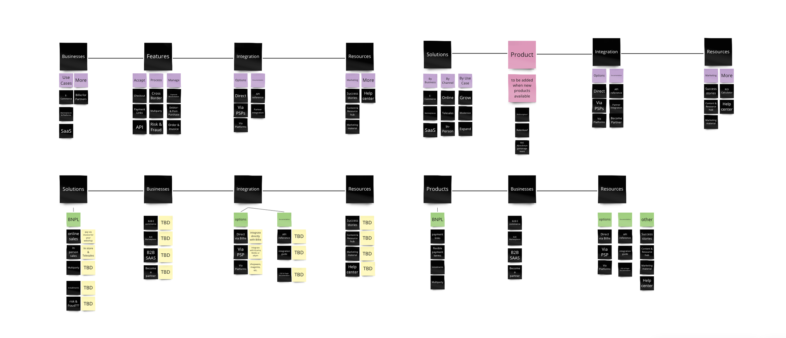
First things first. We took a deep look around. I compared and mapped our top competitors content, wording and visual direction for us as a base to define our own strategy.
Less talking
We cut text everywhere.
4 instead of 8
Reducing the navigation to it’s core. We analysed what was most important based on sales and customer insights.

But soon we faced two hurdles
Time. We were forced to launch the website quite quickly. This conflicted with our more radical redesign proposal and the time we would need to go live. After some brainstorming and conversations with the tech team, we agreed to launch the website in stages. From an initial adaption of existing components to a more dramatic change later on.
Stakeholders. We did not have a dedicated website team, so we came together from different product areas. This meant we had the combined creativity of three designers, but also led to confusions on stakeholders. Marketing? Product? In the end, we were able to manage through the chaos , but we definitely took some learnings with us as well.

A few chaotic meetings, sweat and beers later… We found our way by splitting work.
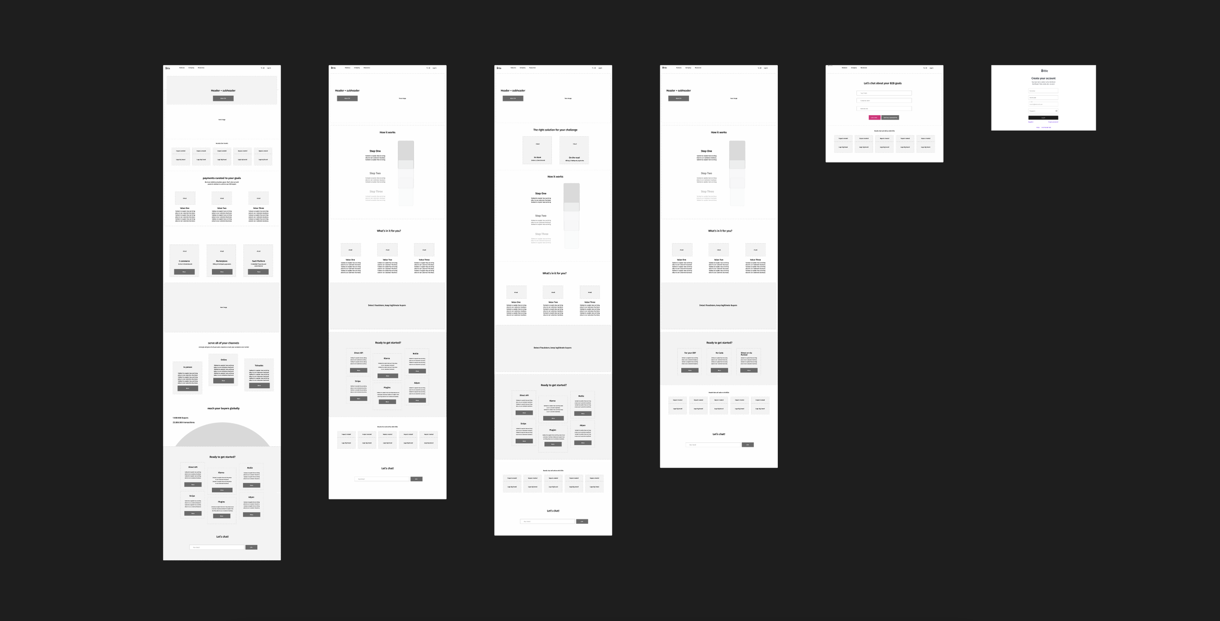
Invisible. We split up the development into release stages. I worked in parallel to our UI designer on architecture, content and overall flow. As Petr developed the visuals for the landing, i went on to define the content of the rest of the pages. You can see one of my earlier iterations for the landing page below.
Visible. In the meantime, Petr was able to focus on everything UI and branding. We had brainstormed on the visual language and chose a direction together. He then went on to refine and adopt the new designs across the website.